See below for some earlier iterations of static visualizations done in Python matplotlib for exploration and data analysis purpose, with some insights we’ve learned from studying them:
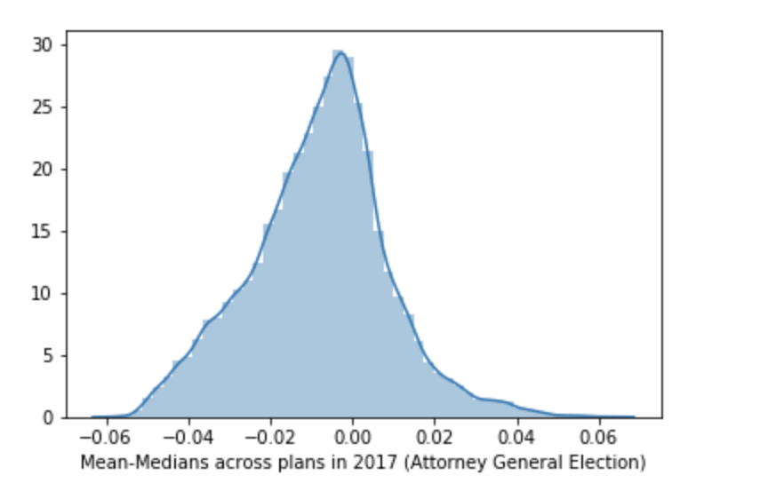
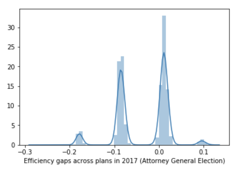
Insight: efficiency gap is really just share of democratic seats +/- some noise (not a very good metric at all - none of them are!). Insight: Mean median score is uniformly distributed across plans.
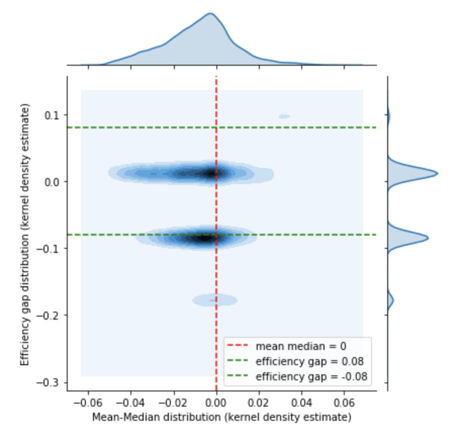
Insight: The above graph shows about the correlation on distribution for efficiency gap and mean-median distribution. The smaller the absolute values of the gap, the larger the range for mean-median distribution, with tail towards left. Also, most observations lies in between reasonable efficiency gaps, with mean-median distribution (double exponential distribution) centered around 0.
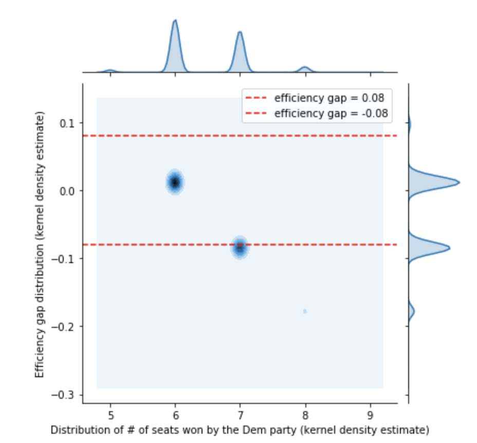
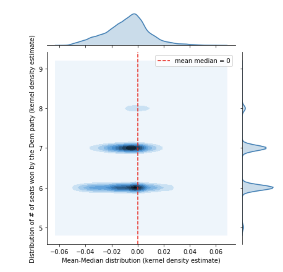
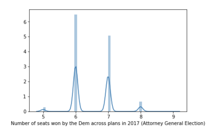
The smaller the number of seats taken by democrats, the larger the difference in mean-median distribution (for a number of more than 6 seats). What would be a good interpretation of such correlation? Shows that mean median is not a good indicator of # seats. The mean median left tail is a quite VA-specific thing.
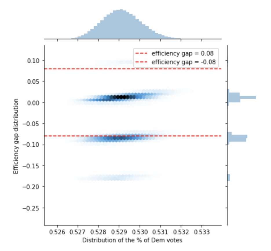
When plotting the distribution of efficiency gaps against the distribution democratic vote shares, it is interesting to see the positive slope between those 2 metrics. Thus, as Democrats increase their vote share, the efficiency gap tends to suggest more of a Democratic advantage.
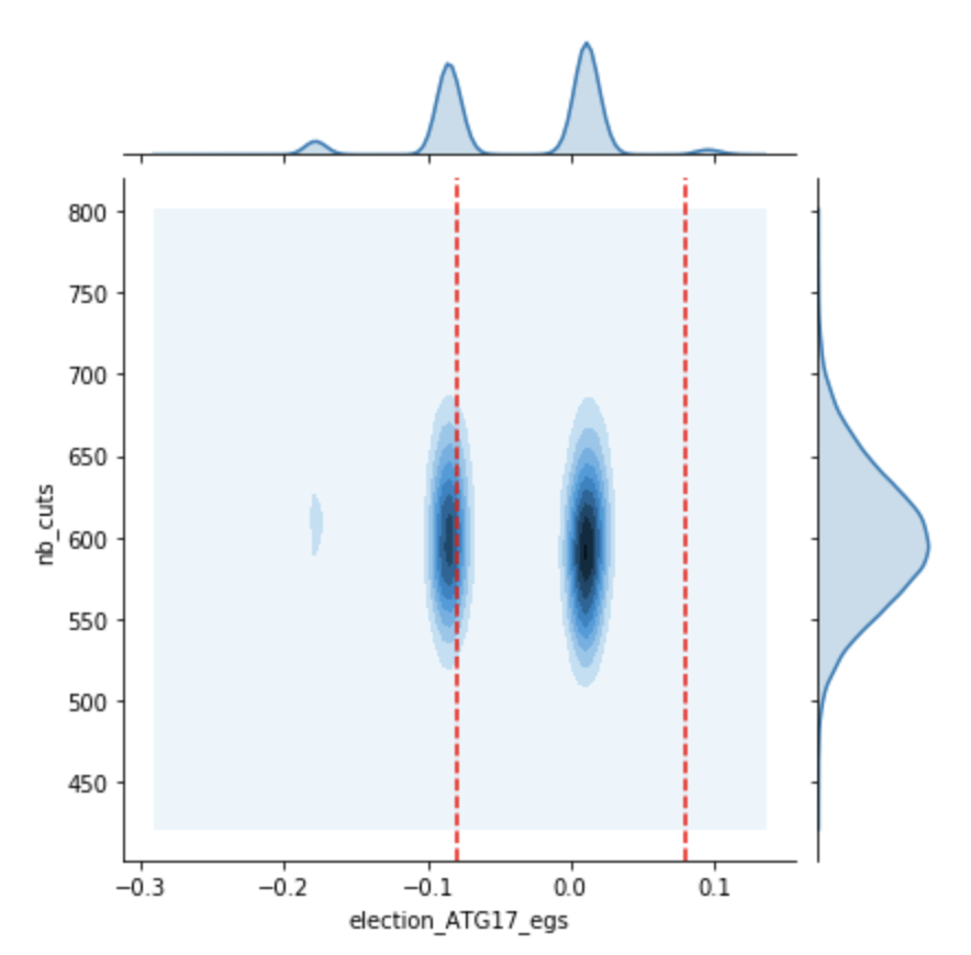
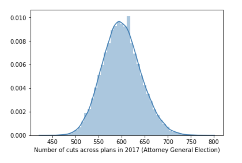
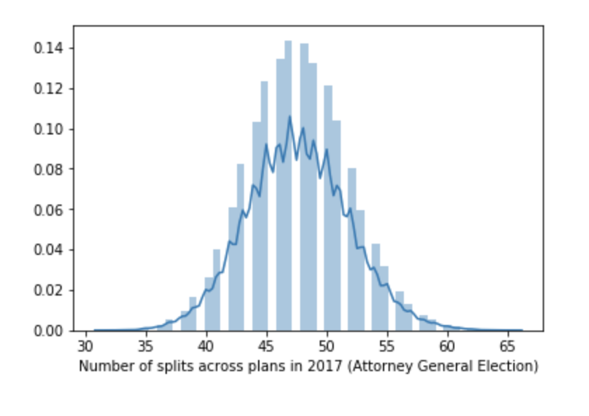
Contrary to popular belief, this one shows that it is not necessarily true that fewer cuts mean better efficiency gap!
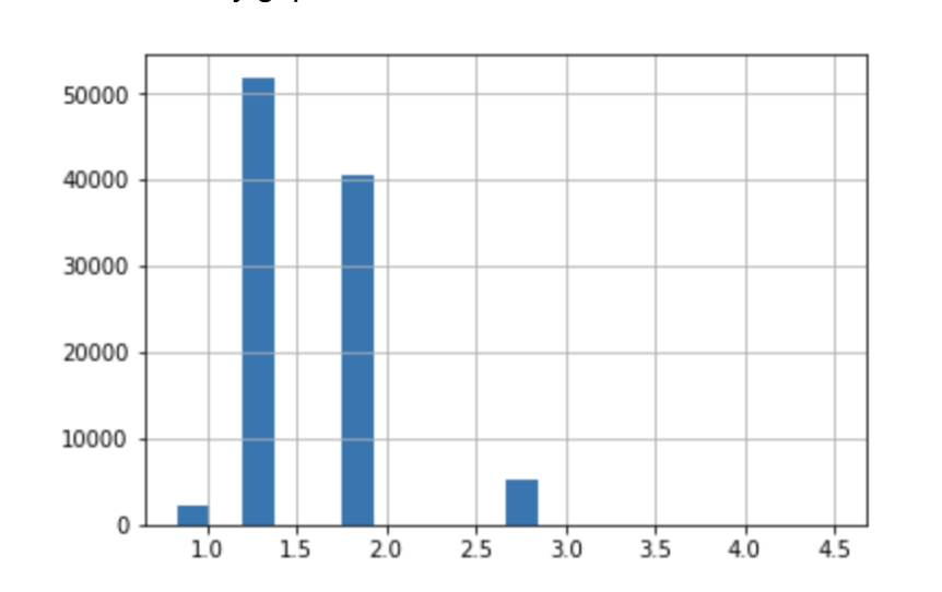
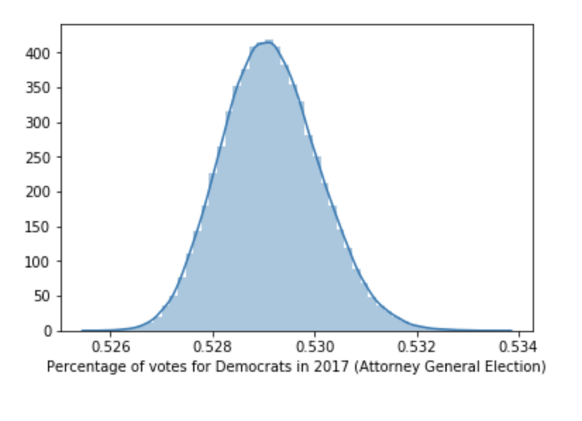
On average, Virginia is a “naturally” democratic state. The histogram shows the distribution of the ratio (#Dem seats / #Rep seats) across plans. It confirms that that ratio is more than 1 in most cases.